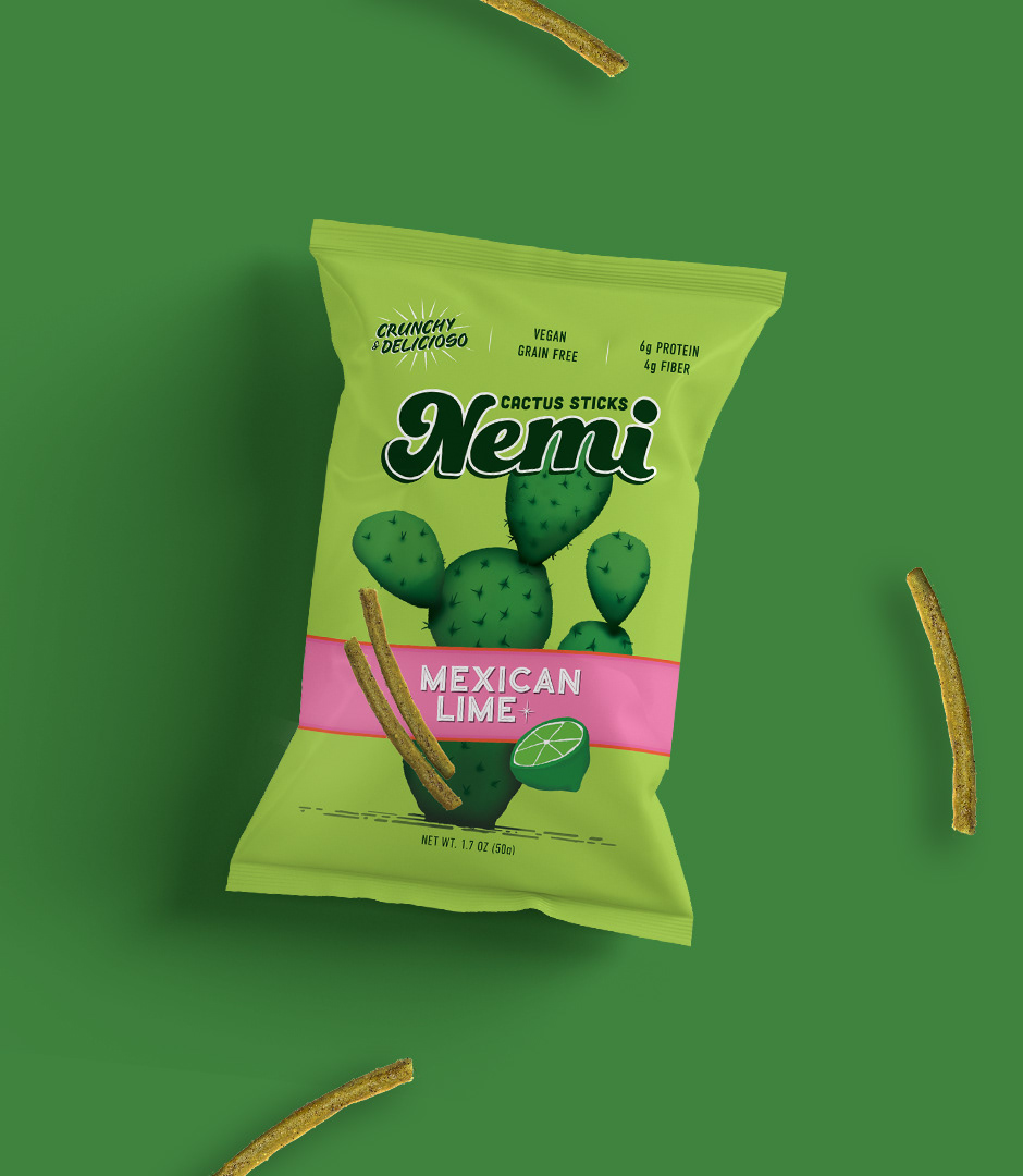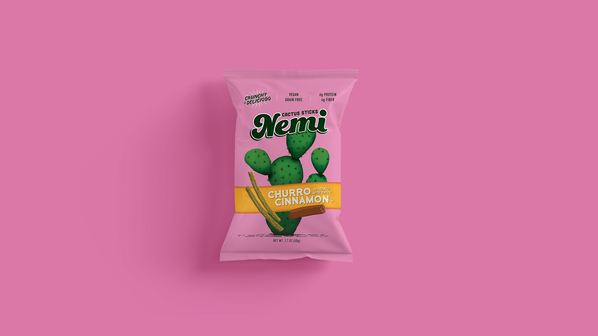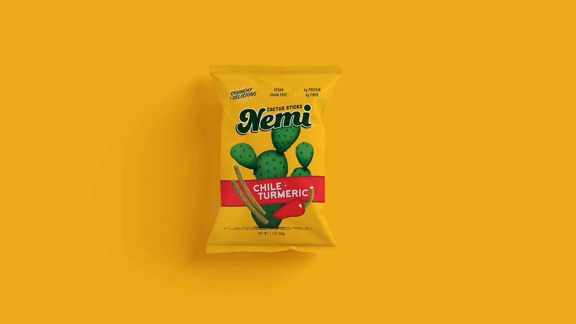
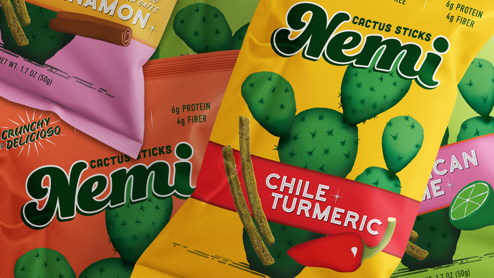
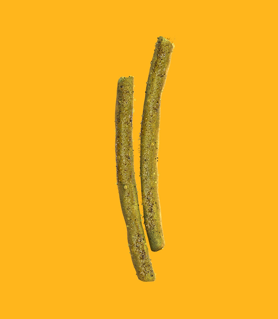
Nemi: First healthy churritos snack brand in the US
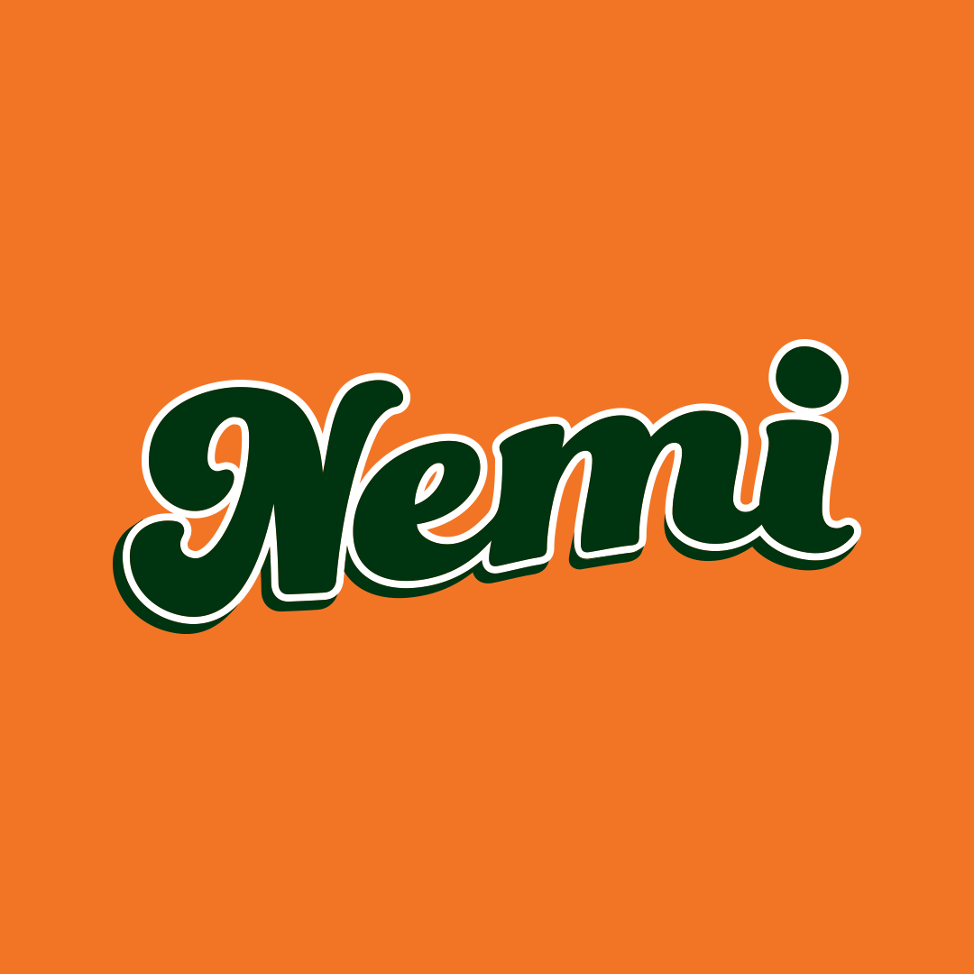
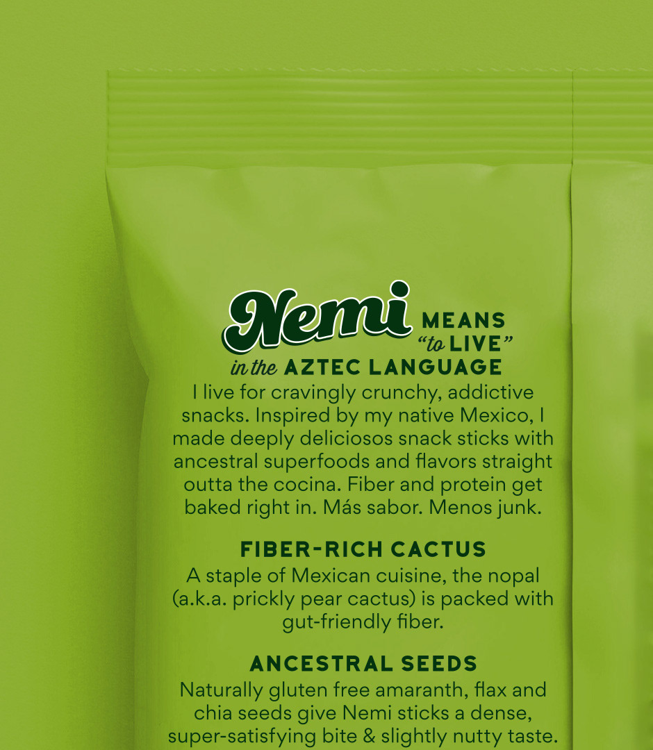
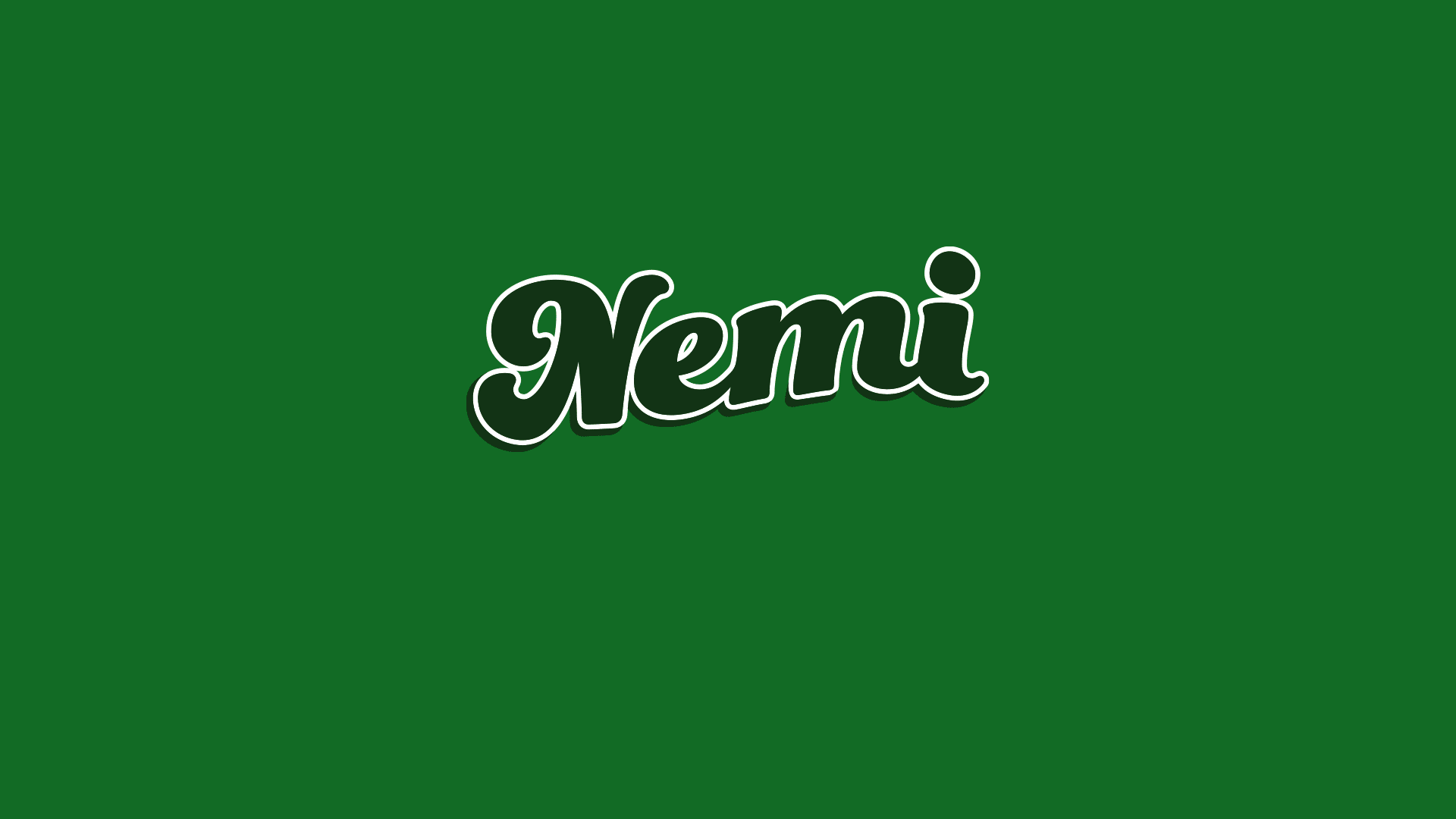
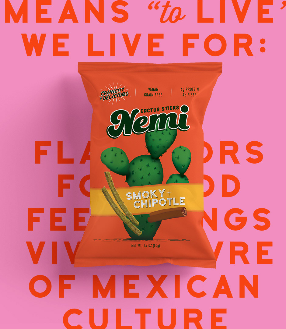
Nemi is a growing company that proudly represents Mexican culture through a taste full of crunch. The name of the brand means, “to live” in the language of the Aztecs.
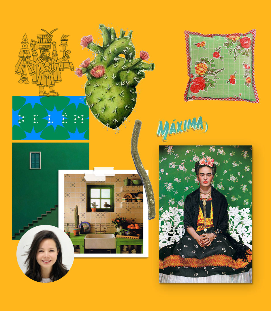
The main task was to re design the identity and package of Nemi throughout a new fresh style and language that allowed bonding in a more effective way with the new generation that is more aware of the transcendence of a healthier way of life and the importance of a wholesome diet. The product is a snack, but a healthy one.
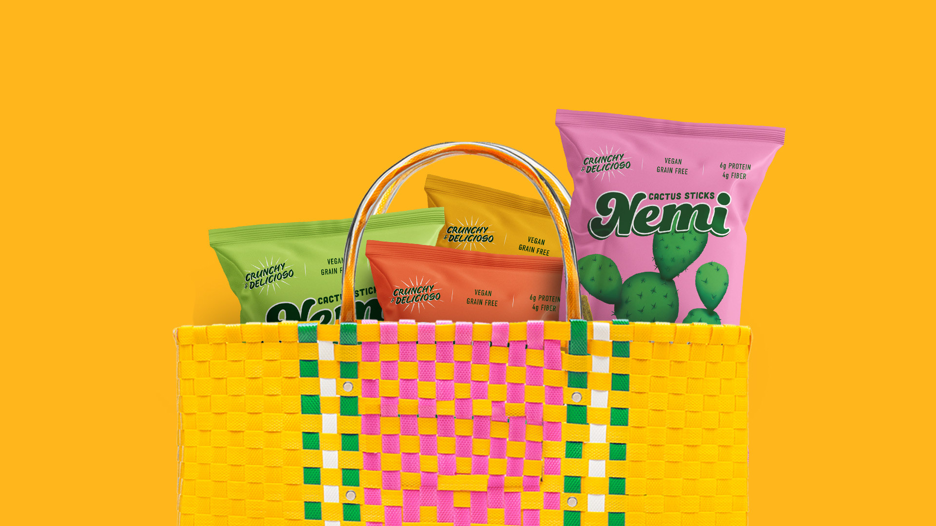
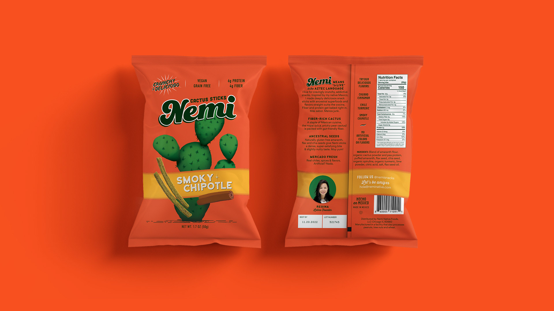
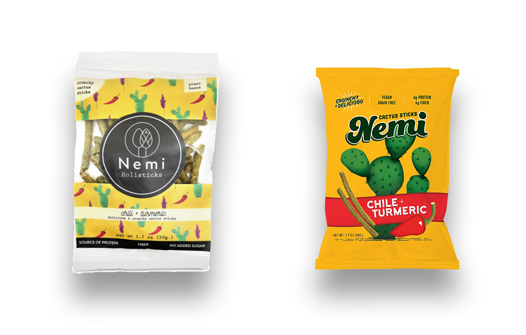
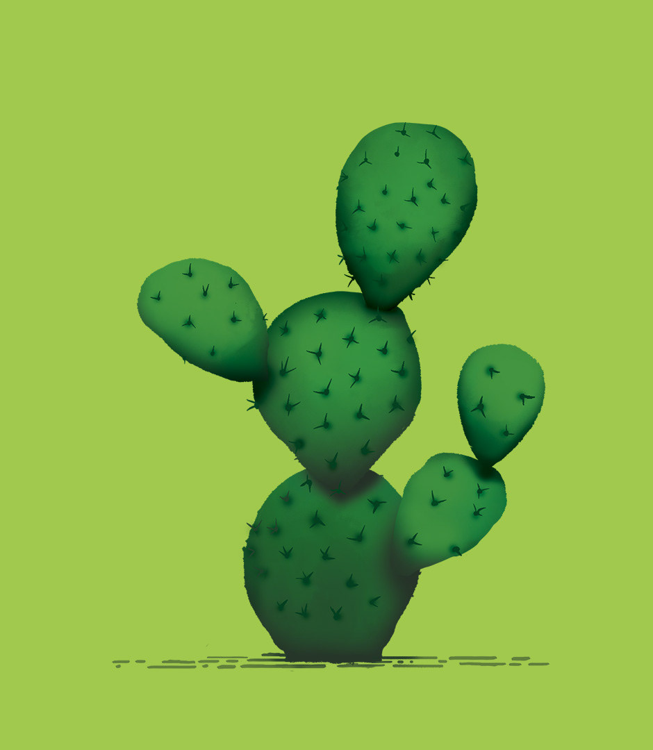
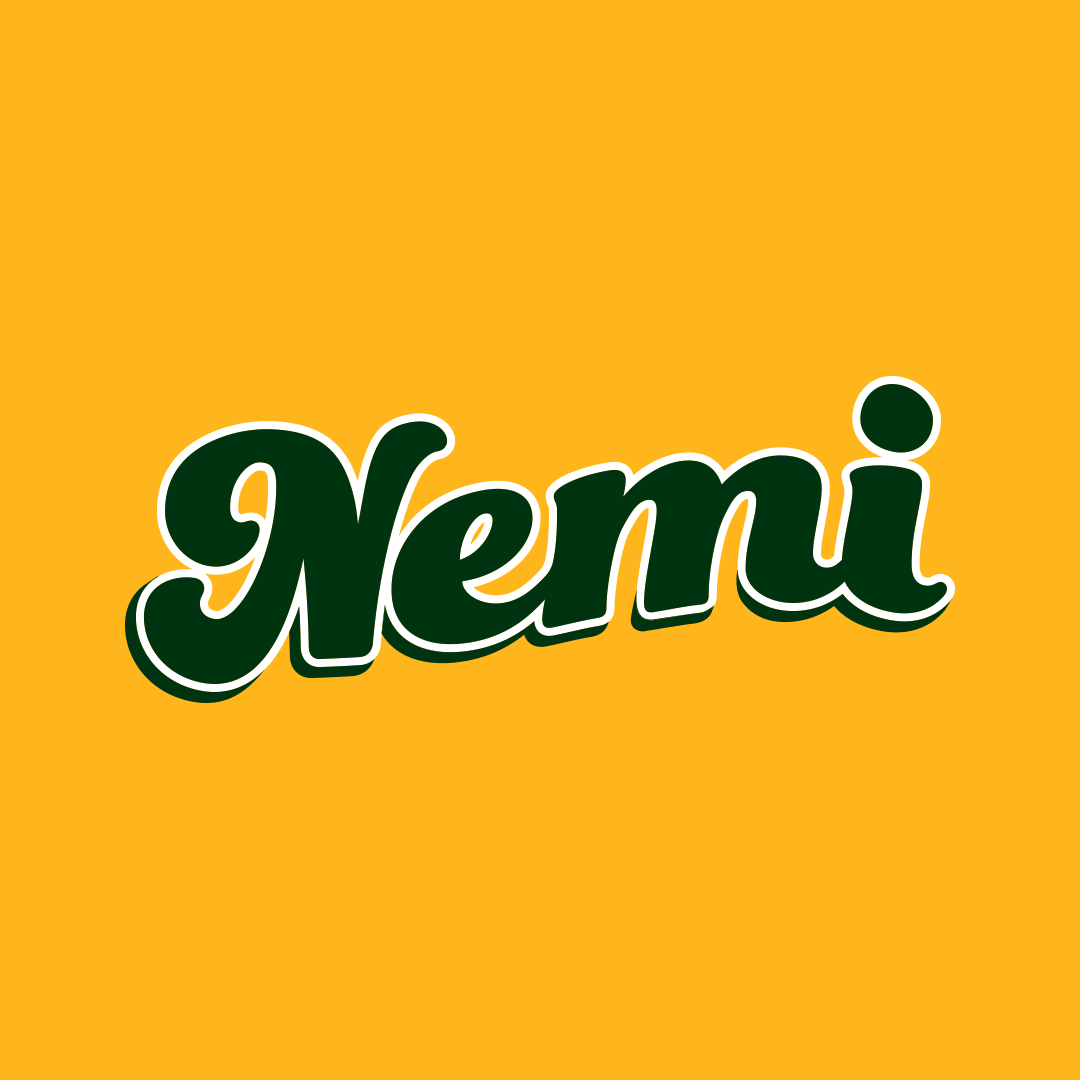
The new logo was designed inspired by traditional Mexican iconography that can be found on the streets of most Mexican cities but adding a contemporary look that merges tradition with modernity to denote a dynamic and up-to-date product. The bold colors, round edges on the typography and the lively energy of the logo itself was achieved summarizing the features of the product.
Foodboro Fave rebrand of the year 2021