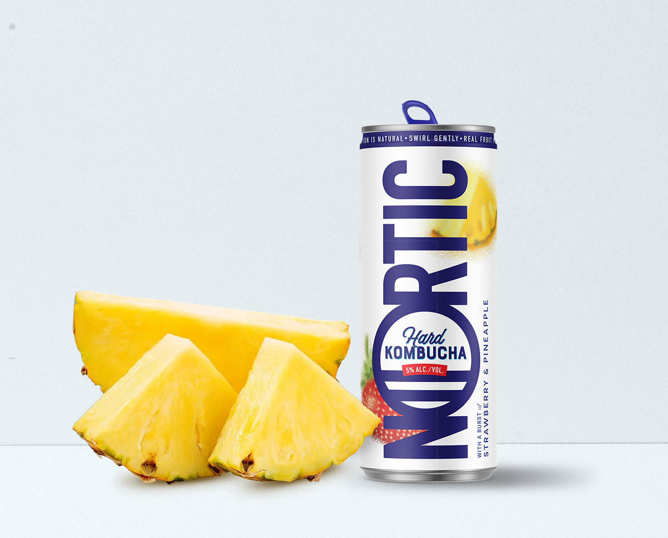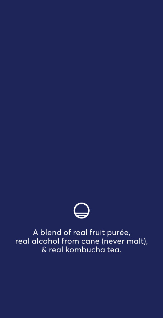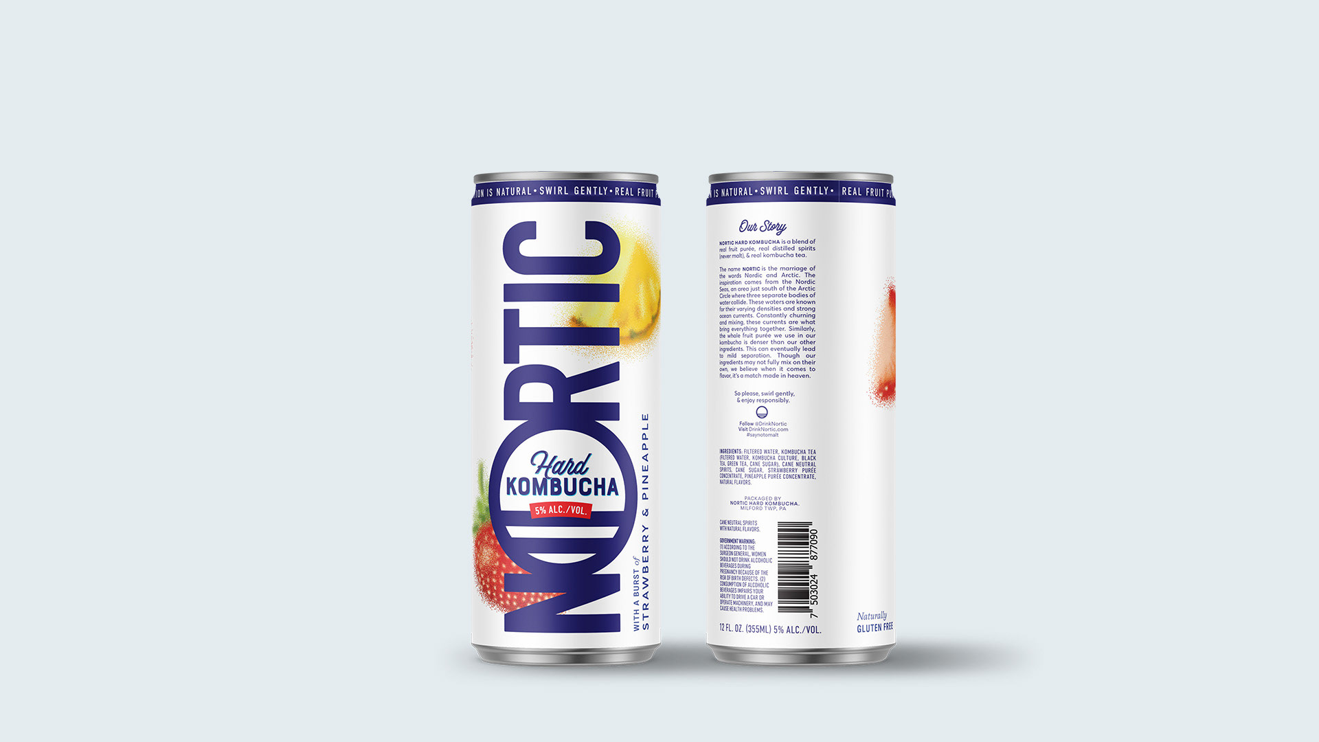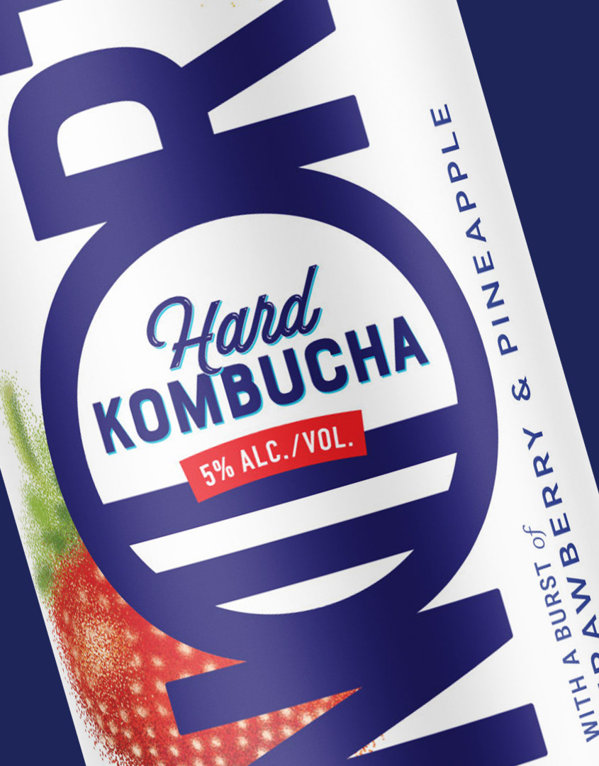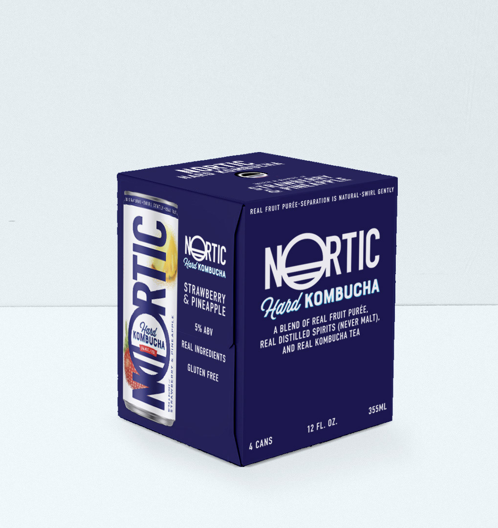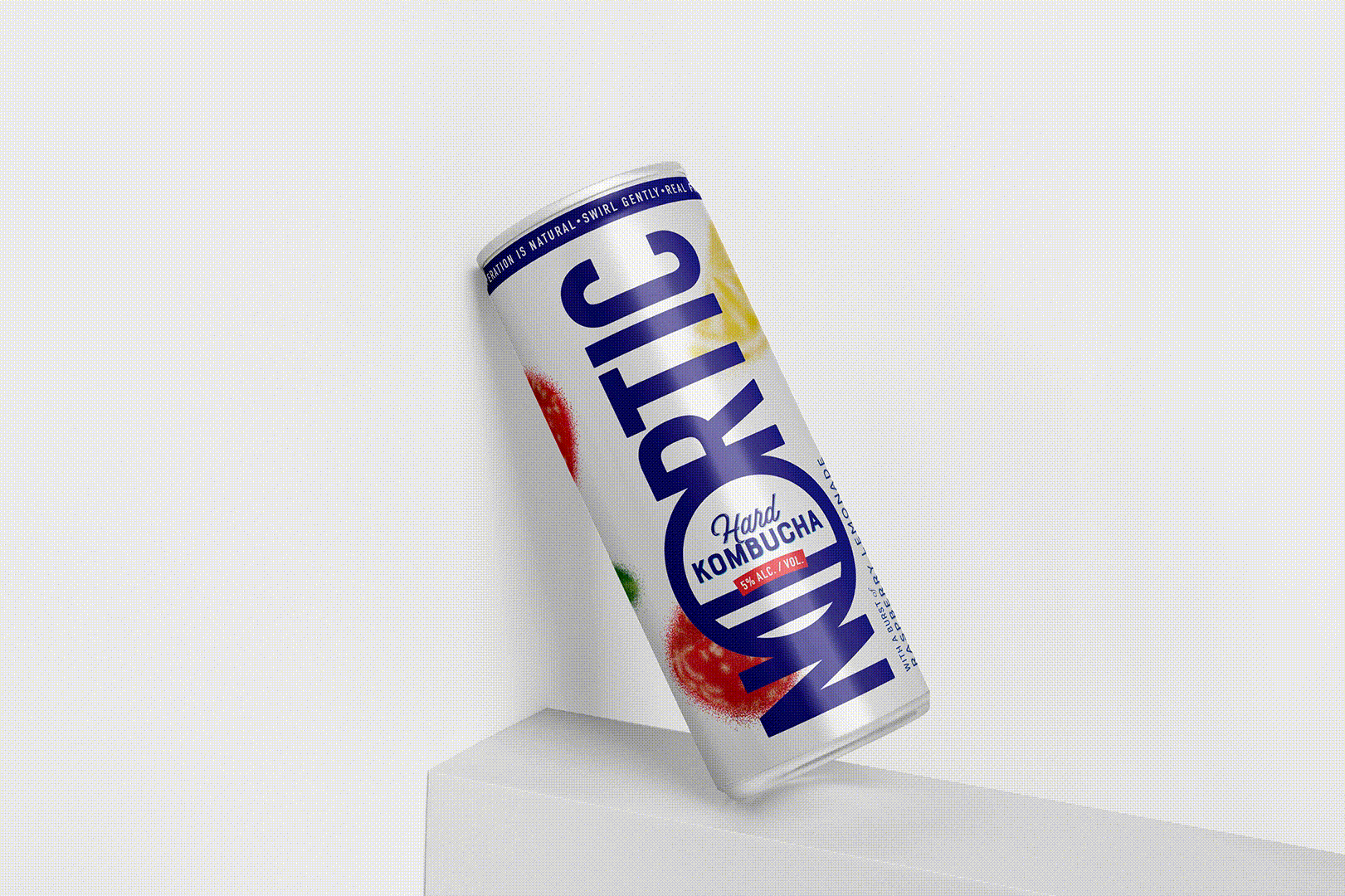
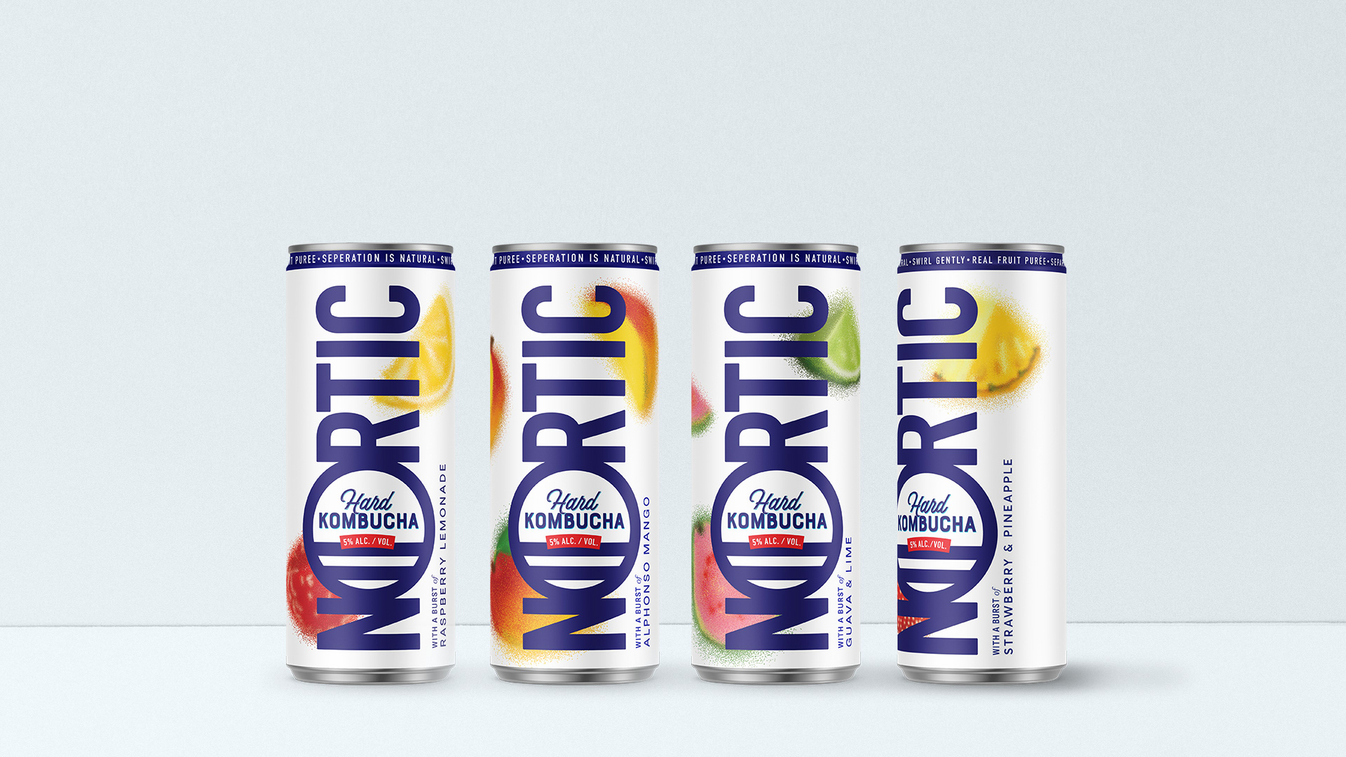
Nortic is a blend of real kombucha tea, real distilled spirits, and whole fruit purée.
The name Nortic is the marriage of the words Nordic and Arctic. The design is direct and simple: with the name in front and turning it over, the letter O becomes a frame with the description of the drink.
In the brief we were asked to create a design in which the can could clearly be seen as belonging to the world of alternative drinks to beer but give it a twist.
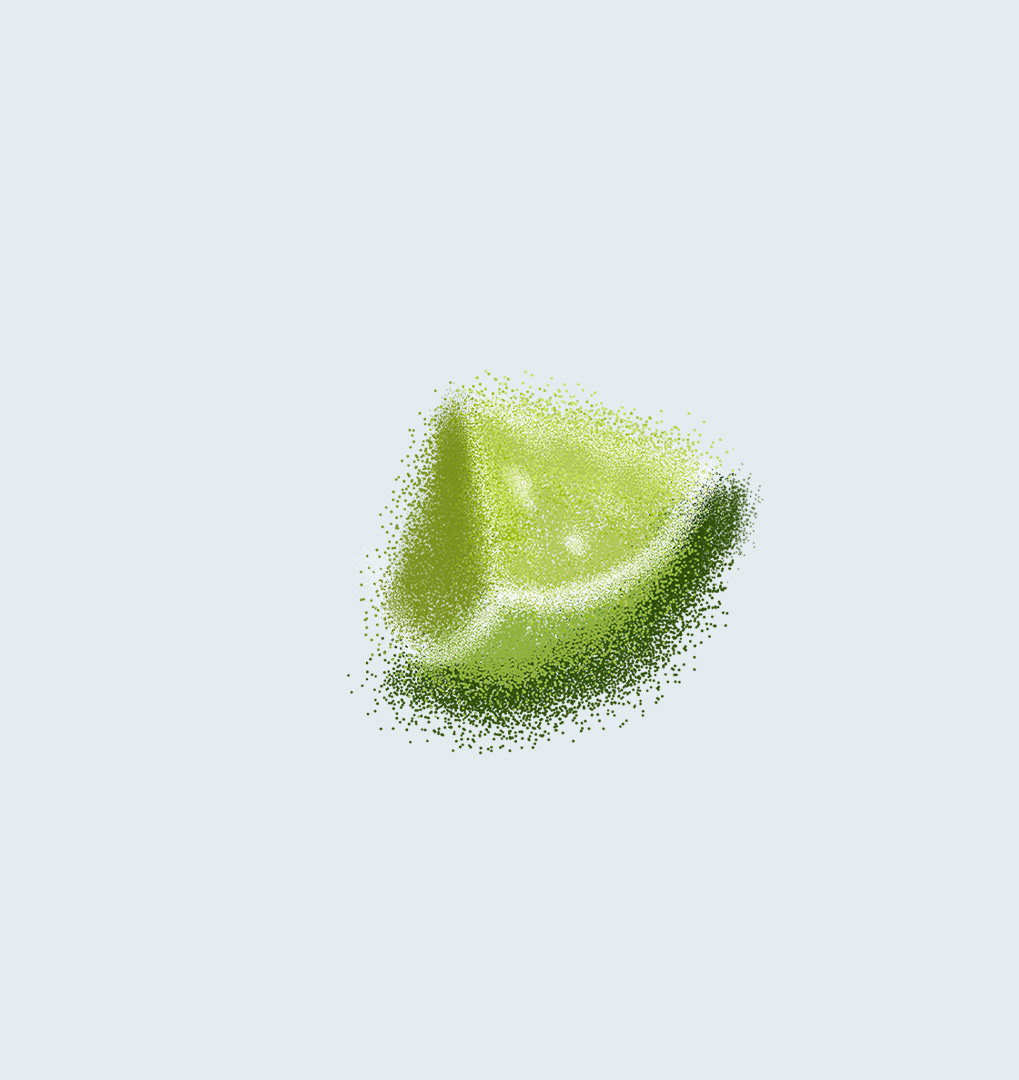
It is a drink that is distinguished by the use of 100% natural fruit juice aimed at a young group that seeks to have fun with as little discomfort as possible, for which we opted for a fun and different graphic expressed in colorful illustrations that stand out from the white background.
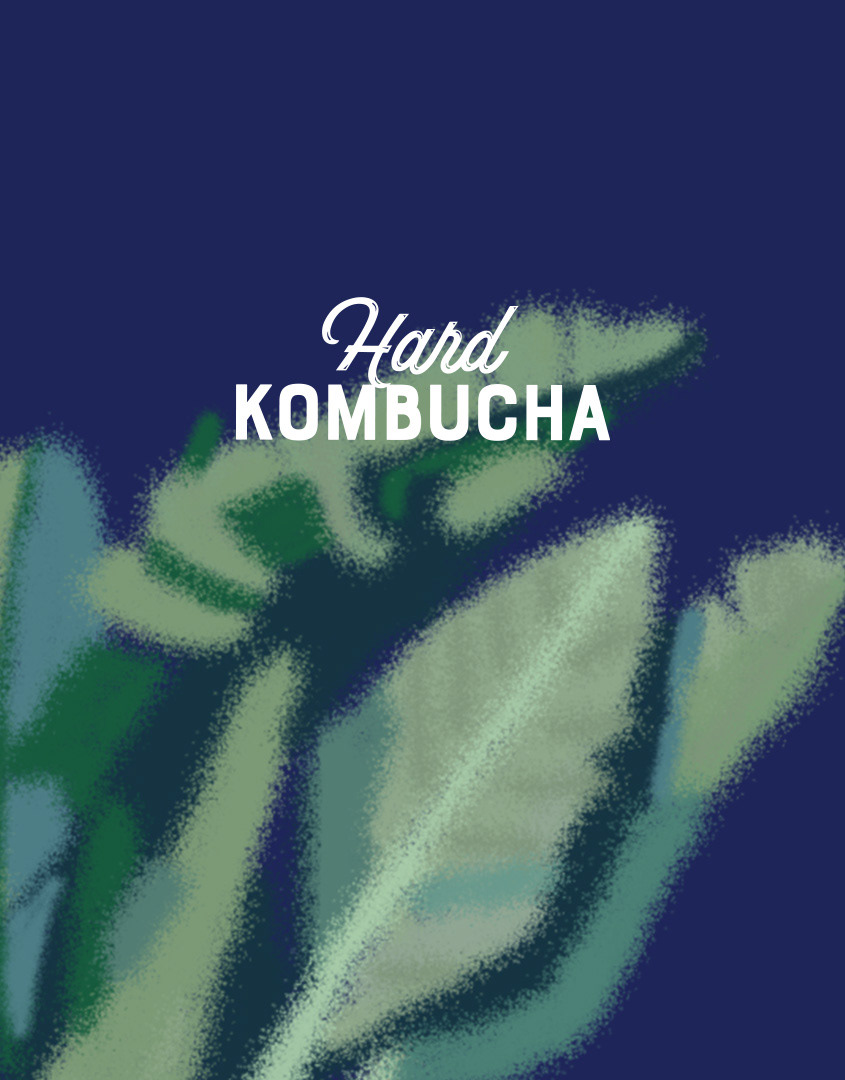
The aesthetic also recalls the maritime life that is linked to the name of the brand and its essence: bringing Caribbean flavours to the US.